


Since the introduction of Responsive Web Design features in GeneXus X Evolution 3 we’ve been able to create responsive web applications with GeneXus.
The Responsive Table control has been the cornerstone of our responsive layouts, allowing us to specify how the application will look in different screen sizes. However, the Responsive Table has some shortcomings:
Flex controls allow us to create flex
ible layouts that “lay out, align and distribute space among items in a container, even when their size is unknown and/or dynamic (thus the word “flex”)”
.
GeneXus 15 Upgrade 12 introduced two new controls: Flex and Flex Grid.
Flex is a container for a static number of items, known at design time, whereas Flex Grid is a type of FreeStyle grid, where we can load as many items as we want, dynamically.
Both flex controls lay out child controls according to what we set in these five properties: Flex Direction
, Flex Wrap
, Justify Content
, Align Items
and Align Content
.
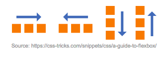
Specifies the direction of the items, which can be placed horizontally (Rows and Rows Reverse) or vertically (Column and Column Reverse).
It allows specifying if items should wrap or if they should fit in a single row

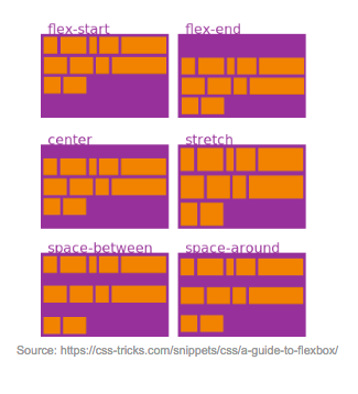
Justify Content
It defines the alignment of the items in the rows (horizontal alignment if Flex Direction is specified as a row, and vertical alignment if Flex Direction is specified as a column).

It defines the alignment of the items in the rows (vertical alignment if Flex Direction is specified as a row, and horizontal alignment if Flex Direction is specified as a column).

Aligns the row when there is extra space in the container.
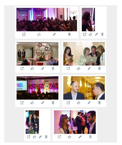
To showcase this new feature we created a photo gallery using Flex and Flex Grid controls.
The gallery shows a set of photos and a toolbar for each photo, with some actions.
Some photos were taken in landscape format and others in portrait format; other photos are panoramic photos, so their dimensions are unknown at design time.

To optimize the experience for users with smaller screens, we want to show the toolbar horizontally, below the photo. On bigger screens, we will want to show the actions vertically on the right side of the photo.
So, let’s see how this can be easily done using Flex and Flex Grid controls. Let’s start with a top-down approach, thinking about the way the photos will be laid out; then we will continue with how each item will be laid out.
We want the photos to flow horizontally and to automatically wrap them to a new row to avoid horizontal scrolling. To achieve this we will use a Flex Grid, where Flex Direction is “Row” and Flex Wrap is “Wrap”. These properties can be set both in the control and in the control’s Theme class.

Then we must figure out how to lay out each grid item. We will use a Flex control, where its first child control will be the photo, and the second will be the toolbar.
In this case, on Extra Small screens (<768px) we want the toolbar to be under the photo, and on other screen sizes we want the toolbar to be next to the photo. As we need different behaviors on different screen sizes, we will have to set the properties through the Theme class of the Flex control. The general value for Flex Direction will be Row, but for the ExtraSmall rule it will be Column.
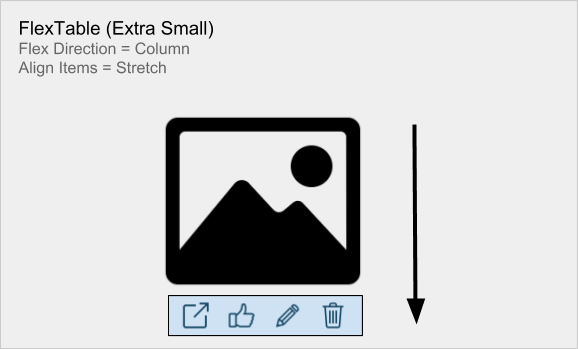

We also want both items to have the same height, when laid out horizontally, or the same width when laid out vertically, so we will tell the Flex control to stretch the items using Align Items=Stretch.
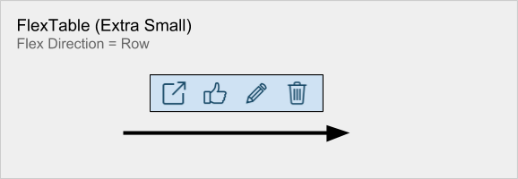
Finally, we have to think about the toolbar that contains the actions. This is similar to the previous case, as we want the action icons to be laid out horizontally for ExtraSmall screens (when the toolbar is under the photo) and vertically on other screen sizes (when the toolbar is located at the right side of the photo).
For the toolbar we will also use a Flex control, and we will set its Theme class Flex Direction property to Row for the ExtraSmall rule, and Column for the general rule.

And that’s almost all of it. One last important detail is to set a maximum height for the photos. If not set, all the photos will be shown at their full size, and it won’t look pretty, at all.
With Responsive Tables we’ve been able to create responsive applications for some time. Now we have their perfect companion, with the introduction of Flex and Flex Grid controls, for those cases were Responsive Tables were not enough, or were too much.
I left out some minor implementation details about the sample on purpose, to keep the focus on the flex controls, but you can take a look at the sample
here
.
You can also play with the
live demo
or continue reading about these cool new controls in the community wiki
here
.
And if you want to know about the underlying technology enabling this feature, this article is a must-read:
A Complete Guide to Flexbox

These are the new features and advances in Total Experience modeling with GeneXus 18, revealed in the talk Total Experience with GeneXus 18.

The market demands the use of Design Systems to achieve consistent designs and efficient development.
Leave a Reply